What is a 5-Star Rating? The Scale Everyone Reads Wrong
A 5-star rating looks like a scale from 1 to 5. In practice it is a thumbs up or down. What the research says about the J-curve, why 4.9 sells worse than 4.7, and when stars are the wrong tool.
A 5-star rating scores a product, service, or experience on a scale of one to five stars, where one is the worst and five is the best. Individual ratings are collapsed into an average, the familiar "4.6 out of 5" printed next to everything you buy, book, or watch.
That is the definition. Here is the part worth knowing: on a scale whose mathematical middle is 3.0, an analysis of roughly 30 million Amazon ratings found the average product sits at 4.2 stars, and 72% of all star ratings are fives. The scale is heavily skewed toward the top, and that is not an accident of one marketplace. It is how five-star scales behave everywhere, and it changes what the numbers actually mean.
Stars came from hotels, not the internet
The star rating is older than the web by most of a century, and it started as something quite different: a mark of distinction awarded by an expert.
Michelin added stars to its restaurant listings in 1926 and expanded to the familiar three-star hierarchy in 1931. Note the ceiling: three stars, not five. A single Michelin star already means a very good restaurant. Three means "exceptional cuisine, worth a special journey". Every star is rare and expensive to earn, so every star carries information.
The ceiling was never fixed at five, either. Michelin stops at three, Mobil chose five, and IMDb asks for ten:
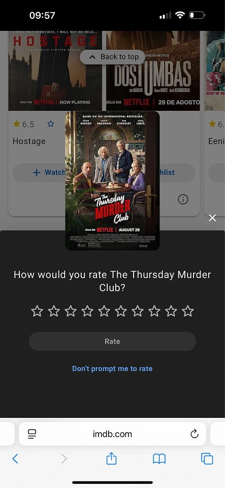
Film criticism picked up the device around the same time. In 1928, Irene Thirer of the New York Daily News began grading movies on a zero-to-three-star scale, likely the first star ratings in film reviews. The five-star version we know from hotels arrived in 1958, when the Mobil Travel Guide (now Forbes Travel Guide) started sending anonymous inspectors to rate hotels and restaurants on a five-star scale.
In all three cases, a trained assessor applied published criteria, and most of the scale got used. The internet kept the stars but handed the rating to everyone, with no criteria and no training. The symbol survived. The meaning did not.
The J-curve: nobody uses the middle
If people rated things honestly and independently, ratings would form a bell curve centered somewhere in the middle. They do not. Ratings form a J: a tall spike at 5, a smaller spike at 1, and almost nothing in between.
This pattern is well documented. Hu, Pavlou, and Zhang studied Amazon ratings and published the results as "Overcoming the J-shaped distribution of product reviews" in Communications of the ACM (2009). They trace the shape to two self-selection biases:
- Purchasing bias. People mostly buy things they expect to like, so the pool of raters is pre-filtered toward satisfaction.
- Under-reporting bias. People with moderate opinions rarely bother to rate at all. Delight and anger drive the effort of leaving a rating; "it was okay" drives closing the tab.
Here is that shape in public. G2 publishes the full breakdown behind every score, so Slack's 4.5 comes with its own receipt:
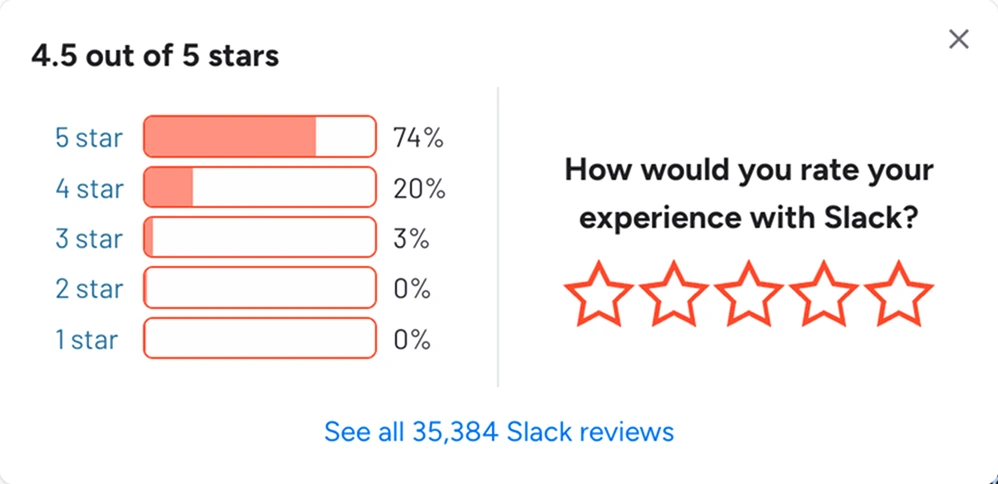
Three quarters of the ratings land on one value. Two of the five options, the entire bottom of the scale, round to zero. A five-point instrument is doing the work of a two-point one.
The practical consequence: 3 stars does not read as neutral. On a scale where the average is 4.2 and most ratings are 5, a 3 is a below-average score, and both buyers and sellers treat it as criticism. The middle of the scale exists on the screen but not in practice.
Why 4.9 sells worse than 4.7
If ratings cluster near the top, you might expect the highest average to win. It does not.
The Spiegel Research Center at Northwestern analyzed purchase behavior across thousands of products and found that purchase likelihood peaks when a rating is between 4.0 and 4.7 stars, then declines as it approaches 5.0. A flawless score reads as suspicious: too few ratings, filtered reviews, or fakes. A few visible bad reviews work as evidence that the good ones are real.
The same research found that displaying just five reviews makes a product nearly four times more likely to be purchased than displaying none. Shoppers are not looking for perfection. They are looking for believable.
So a 4.9 is not "better" than a 4.7 in any commercial sense. Past a certain point, polishing the average is polishing it in the wrong direction.
The Uber problem: when 5 means "fine"
Ride-hailing shows what happens when a five-star scale gets attached to someone's income.
In 2015, Business Insider published leaked internal Uber documents showing that drivers with an average below about 4.6 were considered at risk of deactivation, and that only 2-3% of drivers fell below that line. Do the arithmetic and the scale collapses: if the passing grade is 4.6 out of 5, then a 4 is not "good", it is a complaint, and anything below 4 is a formal report. Riders learned this, and now 5 stars means "nothing went wrong".
The same logic runs through delivery apps and marketplaces. Whenever a rating feeds an algorithm that can cut someone off, the five points quietly become two: "5" and "there was a problem". The interface still draws five stars, but the information content is binary.
Netflix and YouTube quit stars
Two large platforms looked at their own five-star data and reached the same verdict.
In September 2009, YouTube published a post titled "Five Stars Dominate Ratings" with a chart of its ratings distribution: a huge column of fives, a small column of ones, and basically no 2, 3, or 4 stars at all. "Seems like when it comes to ratings it's pretty much all or nothing," the post concluded. The star rating was working as a seal of approval, not a scale, and YouTube replaced it with thumbs up and down the following year.
Netflix held out until 2017, then dropped stars for thumbs too. The company's VP of product, Todd Yellin, gave an unusually honest reason: star ratings measured aspiration, not behavior. People gave five stars to serious documentaries and three stars to silly comedies, then watched the comedies ten times more often. The stars showed who viewers wanted to be. Viewing history showed what they actually enjoyed, so Netflix built recommendations on behavior and kept thumbs only as a light signal. In testing, thumbs also collected 200% more ratings than stars did.
Both companies had five points of resolution and discovered they were using roughly one bit of it.
Worth noting what YouTube asks today. The stars are gone, but the five positions are not:
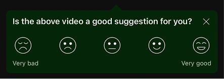
The lesson it took was not "five points are too many". It was "stars are the wrong way to draw them".
What the average actually hides
The number next to the stars is an arithmetic mean:
Average rating = (sum of all ratings) ÷ (number of ratings)
Take a concrete case, 20 ratings for one product:
| Stars | Count |
|---|---|
| 5 | 14 |
| 4 | 3 |
| 3 | 1 |
| 2 | 0 |
| 1 | 2 |
The sum is 87, so the average is 87 ÷ 20 = 4.35, displayed as 4.4 or rendered as four and a half stars. Fourteen delighted customers and two angry ones produce the same picture as twenty mildly pleased ones.
The mean also makes negative ratings expensive to offset. To keep an average at 4.5, every 1-star rating needs seven 5-star ratings beside it (7 × 5 + 1 = 36, and 36 ÷ 8 = 4.5). One bad experience quietly demands a week of great ones.
Sample size matters more than the decimal. A 4.8 built from 12 ratings can be two enthusiastic friends and some luck; a 4.4 from 900 ratings is a measured fact, including the survivable share of bad days. The Spiegel research above says buyers intuitively price this in.
And the half stars you see everywhere are not something anyone chose. No form offers "4.5 stars" as an answer. Half stars are a rendering of the average, a display trick, not a rating anyone gave.
Underneath all of that sits a measurement problem. Star ratings are ordinal data: the positions are ranked, but the gaps between them are not equal, and nobody can measure them. The distance from 1 star to 2 is not the distance from 4 to 5, and most people would say it is nowhere close. An arithmetic mean assumes those gaps are identical, because adding the values together is what it does. Averaging star ratings applies interval arithmetic to ordinal answers, which is why the decimal that comes out looks far more precise than it is.
Stars vs CSAT vs NPS
This is the actual reason CSAT and NPS exist. They are not fancier star ratings. They are ways of summarizing the same answers without taking a mean.
| 5-star rating | CSAT | NPS | |
|---|---|---|---|
| What it is | A presentation format | A calculation method | A loyalty metric |
| Scale | 1 to 5 stars | Short scale, often 1-5 | 0 to 10 |
| The number | Mean of all ratings | Percent who chose 4 or 5 | Percent promoters minus percent detractors |
| Range | 1.0 to 5.0 | 0 to 100% | -100 to +100 |
| Question | "Rate this" | "How satisfied were you?" | "Would you recommend us?" |
Look at the row for the number. Neither metric averages anything. Both count.
CSAT takes the top box: the share of people who picked one of the top positions. NPS goes further and discards the middle on purpose, subtracting the share of detractors (0 to 6) from the share of promoters (9 to 10) and leaving the 7s and 8s out of the arithmetic entirely. Both produce a proportion, and a proportion survives a J-shaped distribution that a mean cannot. Counting how many people landed above a line makes no assumption about the spacing between positions, which is exactly the assumption that breaks when you average stars.
Run the 20-rating example above through both approaches. The mean says 4.35, rounds to 4.4, and reads as "good". CSAT counts the 17 people who picked 4 or 5 and says 85%, which also says 15% of these customers are not in the top box, including two who are furious. Same answers, different summary, and only one of them is still pointing at the people you need to talk to.
The remaining distinction is presentation: stars are how you draw the question, CSAT is how you count the answers. The same five positions can be rendered as stars, emoji, or plain numbers.
Here is one question in three renderings. The answer positions are identical, only the drawing changes.
Same five positions, same arithmetic afterwards. What changes is what the reader thinks they are being asked: stars read as a verdict, emoji as a mood, numbers as a grade.
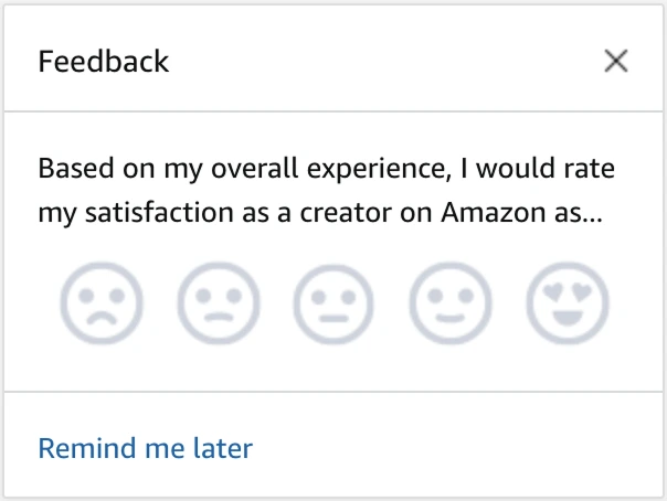
Real products make this choice deliberately. Amazon asks creators the same satisfaction question with faces, not stars:
There are more of these in our gallery of real customer feedback forms, sorted by the metric behind them.
So should you use 5 stars?
Sometimes. The star scale earns its place under specific conditions, and fails under others.
Where it works:
- The metaphor is universally known. Nobody has ever needed the star scale explained, which is worth a lot in a survey shown to strangers.
- Zero learning cost for one-off transactions. Rating a delivery, a stay, a purchase: a familiar scale answered in one tap.
- You only need a coarse signal at volume. If thousands of ratings feed a ranking, the J-curve averages into something usable.
Where it fails:
- You need the reason behind the score. Stars tell you that something went wrong, never what. A rating without a follow-up question is a number you cannot act on.
- You need resolution at the top of the scale. When almost every answer is a 5, the difference between "fine" and "excellent" is exactly the difference the scale cannot see.
- The score affects someone's livelihood. As Uber shows, the scale collapses to pass/fail while still looking like five points, which is unfair to the rated and misleading for the rater.
Read those two lists together and the pattern is hard to miss. The star scale is good at getting an answer and bad at explaining it. That is a workable division of labour, as long as something else does the explaining.
So treat the rating as a trigger, not a measurement. One tap costs the user almost nothing and tells you which question to ask next: a 5 asks what to keep, a 2 asks what broke.
That is the part worth building around. In feedback.tools you choose the five positions and how they are drawn, then the follow-up question and the theme analysis carry the meaning. The score decides which question to ask. The sentence after it is the actual feedback.

FAQ
What does 4.5 stars actually mean?
It is an average, not an answer anyone gave. No rating form offers 4.5 as an option; the half star is a rendering of the mean. A 4.5 typically means a large majority of 5s with a minority of low ratings mixed in.
Is 4.9 better than 4.6?
Not for sales. Research from the Spiegel Research Center shows purchase likelihood peaks between 4.0 and 4.7 stars and declines closer to 5.0. Near-perfect scores read as too good to be true.
Why do most ratings cluster at 5?
Two selection biases: people mostly buy things they expect to like, and people with lukewarm opinions rarely rate at all. Delight and anger motivate ratings; indifference does not. The result is a J-shaped distribution with peaks at 5 and 1.
How many reviews make a rating trustworthy?
Displaying even five reviews makes a purchase nearly four times more likely than showing none, per the same Spiegel research. As a reader, weight the count as much as the average: 4.4 from 900 ratings is stronger evidence than 4.8 from 12.
Are hotel stars the same thing?
No. Hotel and restaurant stars (Michelin, Forbes Travel Guide) are awarded by professional inspectors against published criteria, and Michelin's scale tops out at three stars. Online star ratings are averages of unvetted public votes. Same symbol, different systems.