What Is a Good NPS Score?
What NPS of 30, 50 and 70 means, why published benchmarks disagree, and which one to compare your own score with.
What is a good NPS score? The short answer:
- Above 0 is good. You have more
promotersthandetractors. - Above 50 is excellent.
- Above 70 is world-class.
That is roughly the answer HubSpot1 and Shopify2 give. Other sources draw the upper lines in different places, which the next section covers.
The longer answer has two conditions.
- Your industry. The same
30is a middling result in SaaS, where self-reported scores cluster around40-45(8base, 2024)3, and a strong one in a market whose customers are harder to please. Industries differ in how freely their customers hand out a 9 or 10. - Who gets asked. A company surveying its own active users gets a different number than an independent survey asking the whole market about the same company.
Most benchmark pages skip the second condition. This one spends a section on it, because it is the reason the same industry gets published figures that are far apart.
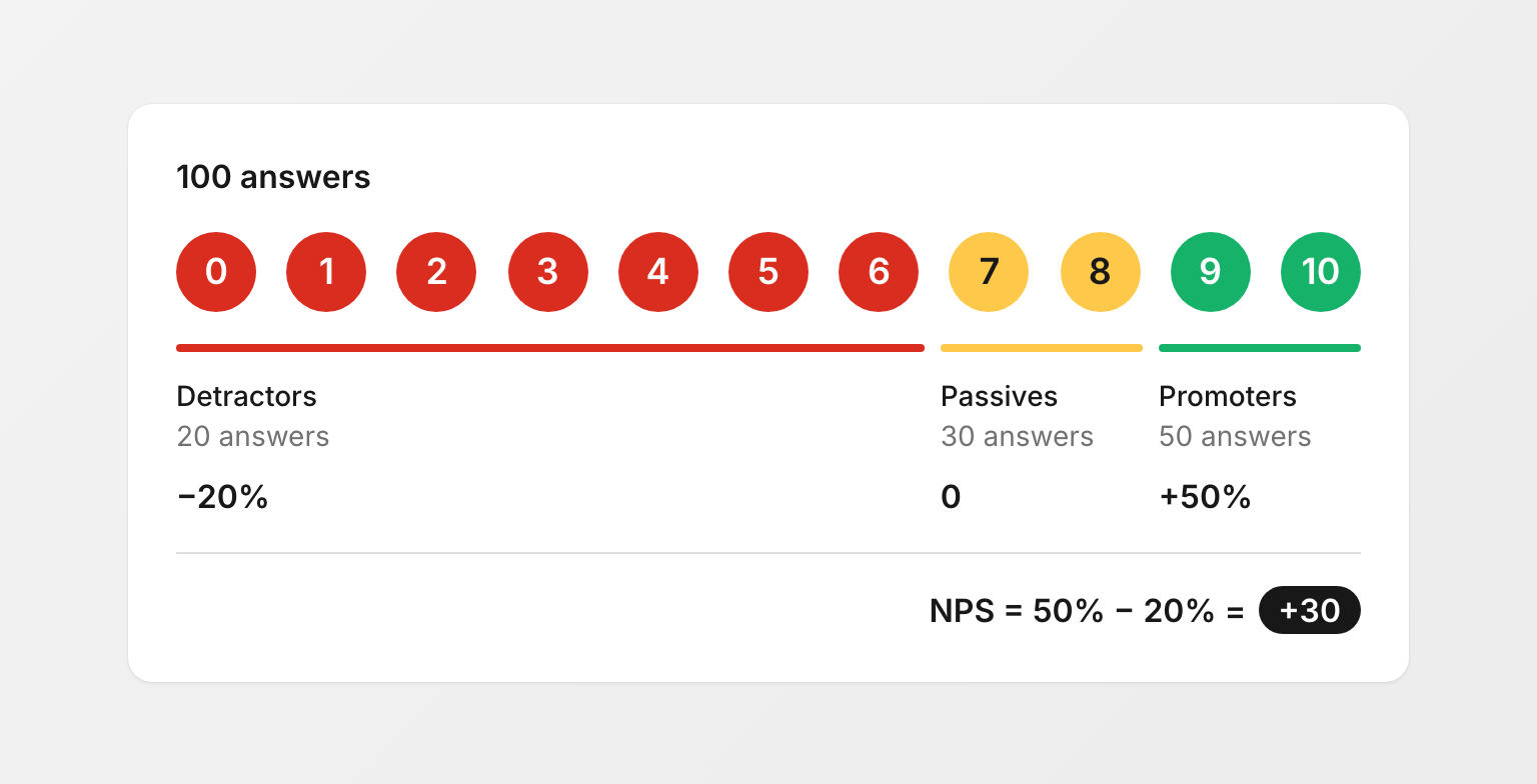
If you need the basics first: NPS asks one question on a 0-10 scale. The score is the share of promoters (9-10) minus the share of detractors (0-6), from -100 to +100.
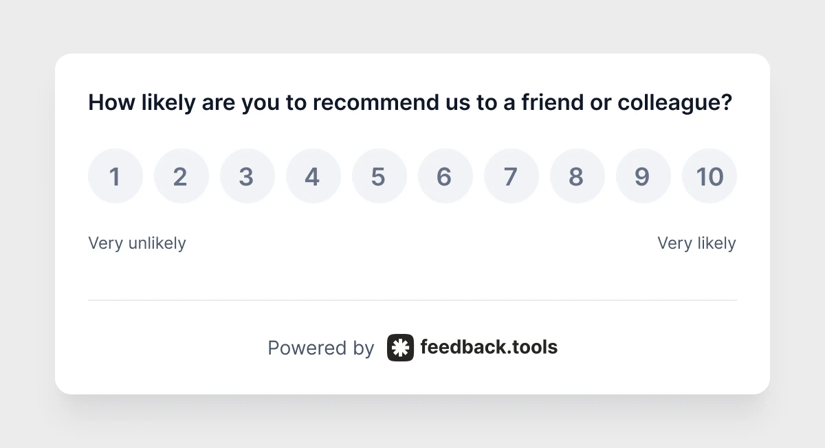
The full definition is on the What is NPS page, and the NPS calculator turns raw answers into a score.
One note on notation. NPS is a difference between two percentages, not a percentage itself, so it is an NPS of 30, never 30%.
The NPS scale: what each range means
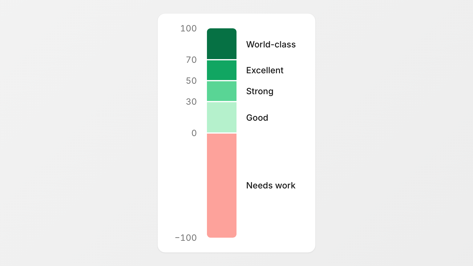
The published scales agree on three lines: above 0 is good, above 50 excellent, above 70 world-class (HubSpot1, Shopify2). The table below adds a split at 30 so the wide 0-50 band is easier to read. That split is ours. All of it is a convention, not a measurement, so treat the boundaries as rough.
| NPS | Reading | What it says about your customer base |
|---|---|---|
| Below 0 | Needs work | More detractors than promoters. Word of mouth is working against you. |
| 0 to 30 | Good | Promoters outnumber detractors, but by a thin margin. |
| 30 to 50 | Strong | Clearly more promoters than detractors. |
| 50 to 70 | Excellent | Few detractors left to convert. The line HubSpot (2025) and Shopify (2026) both call excellent. |
| 70 to 100 | World‑class | Common in scores companies publish about themselves, which are measured on a friendlier sample. |
Keep in mind what the score is made of:
9-10counts for you.7-8counts for nothing.0-6counts against you.
A customer who picks 9 is the lowest-scoring person who helps your NPS at all.
The published scales do not agree
The catch is that the published scales contradict each other, and the disagreement is largest in exactly the range where most companies land. Take an NPS of 30 and read it against each scale:
| Scale | Who uses it | Where 30 lands |
|---|---|---|
| Above 0 good, above 20 favorable, above 50 excellent, above 80 world-class (usually attributed to Bain) | Salesforce4; 8base (2024)3 uses the same 0 / 20 / 50 steps and calls above 20 great | Favorable |
| Above 0 good, above 50 excellent, above 70 world-class | HubSpot (2025)1, Shopify (2026)2, Eliassen5 | Room for improvement |
| "The best performers receive an average NPS score of 80 or better" | IBM6 | Weak |
None of these scales comes from a dataset. The 0 / 20 / 50 / 80 version is quoted as "Bain says" on several pages. Bain & Company is where Fred Reichheld created NPS, but Bain's own pages on the Net Promoter System7 do not publish a scale at all. The scales are rules of thumb. Treat them as vocabulary, not as targets.
Is 30 a good NPS score?
Yes, with a qualifier. An NPS of 30 means promoters outnumber detractors by 30 percentage points, which clears the line every published scale calls good. How good depends on the scale: from favorable to weak, as the table above shows. It is also below every score on the lists companies publish about themselves, because those are measured on friendlier samples. Read 30 as a solid result from your own survey, not as a market position.
How the scales read it:
- Favorable on the 0 / 20 / 50 / 80 scale (Salesforce4, 8base3).
- Good with room for improvement in Shopify's words (2026)2.
Against the scores companies publish about themselves, 30 looks weak. The lowest entry on HubSpot's list of best NPS scores (2025)1 is Apple at 61.
The gap is not a quality gap. A company asks its own customers, usually the active ones, often right after a good interaction, and then decides whether to publish the result. The section on why benchmarks disagree returns to this.
For now, one rule. If 30 is the result of your own in-app or email survey, expect to be below most company-published figures, and compare it with your own previous score instead.
Is 50 a good NPS score?
Yes, on most published scales. An NPS of 50 means promoters outnumber detractors by 50 percentage points. The 0 / 20 / 50 / 80 scale calls it excellent, and HubSpot (2025)1 and Shopify (2026)2 both set 50 as the line for excellent. IBM's best performers line at 80 is the exception.
Among self-published company scores the bar is higher. On HubSpot's list, 50 would sit below all eight companies. Life Is Good, a clothing brand, reports an NPS of 91 against an apparel average its president puts at 39 (Shopify, 2026).
So 50 is excellent on most scales and an unremarkable self-published result. Both statements are true at once.
Is 70 a good NPS score?
Yes, an NPS of 70 is world-class on most scales. HubSpot (2025)1, Shopify (2026)2 and Eliassen5 all set 70 as the line for world-class or the best of the best. Two sources hold out: the 0 / 20 / 50 / 80 scale reserves world-class for 80, and IBM's best performers line6 also starts at 80. Among self-published company scores, 70 sits near the bottom.
On HubSpot's list, Zoom's 70 is the second-lowest entry, below Amazon (73), Warby Parker (80), Metro Bank (82), Nutanix (92), Tesla (97) and Princeton Mortgage (98).
Two cautions:
- NPS is not a percentage. People search "Is 70% NPS good?", and the answer starts with the notation. Eliassen writes its own score as
82.2%, and IBM's definition says the net "is converted into a percentage". Both are wrong on the notation, and the mistake spreads. - Sample matters. A
70from 40 responses collected right after onboarding and a70from thousands of responses across the whole customer base are different achievements. The section on sample size below explains why.
Why NPS benchmarks disagree
Search for an industry NPS benchmark and the first page of results gives you several figures for the same industry, often far apart. These are not typos. They come from three kinds of data, and the pages that cite them rarely say which kind they are using.
1. Companies surveying their own customers. Every self-published company score is of this kind, and so are the aggregate benchmarks that survey vendors compile from their customers' surveys. The respondents are people who already use the product, often active users, often surveyed shortly after an interaction. Lapsed customers and people who never got far enough to form an opinion are underrepresented or missing.
2. Independent surveys of the whole market. The researcher picks the respondents, not the company. Lapsed customers, unhappy customers and people who barely use the product all count. Such studies exist, mostly as paid research, and they are rarely the figures that circulate on benchmark pages.
3. Rules of thumb. The 0 / 20 / 50 / 80 scale and its cousins. No dataset behind them.
The same company measured the first two ways gets two different numbers, and the self-survey is the higher one. This is a sampling effect, not a quality signal. It is one reason the eight scores on HubSpot's list of best NPS (2025)1 range from 61 to 98.
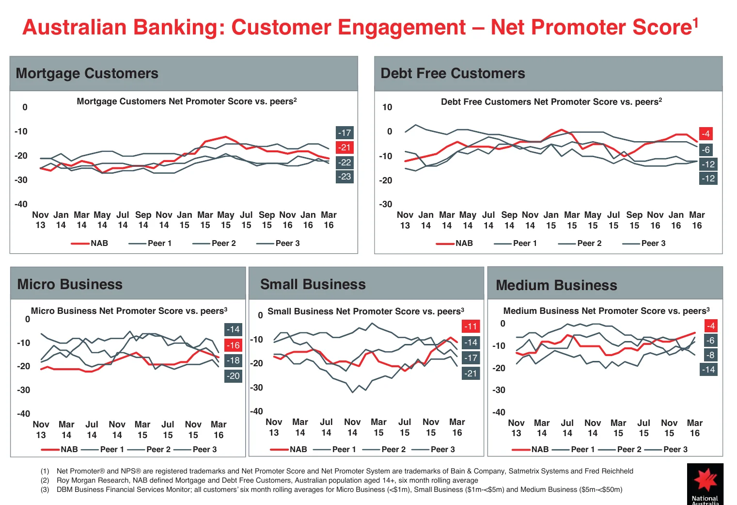
Public type-2 figures are rare. Australian banks are one place to find them: they report NPS from independent surveys (Roy Morgan, DBM, now RFI Global) in which people rate their own main bank, so every bank in the market is measured the same way. In National Australia Bank's 2016 investor deck8, all four major banks scored below zero with mortgage customers, from -17 to -23, and below zero in every business segment, for more than two years in a row. A decade later Commonwealth Bank, ranked first among large business clients, reports 44.3 (December 2025)9. In these bank surveys, even the market leaders land between below zero and the 40s, well below the 70s to 90s that companies publish about themselves.
A fourth problem: second-hand citations
A number travels from a report to a glossary to a dozen blog posts, and loses its method and date on the way. By the third repetition nobody says who was asked, when, or which kind of NPS it was. A high-authority page repeats the figure once, and it keeps circulating for years.
Which type to compare yourself with
Match the benchmark to how the number was collected.
- You survey your own customers, in-app or by email. Your score will land above an independent market survey for your industry even if your product is only average. An independent figure tells you about the market, not about your survey.
- Company-published scores are collected roughly the way you collect yours, but without a stated method or date. Treat them as a ceiling rather than a target.
- Your own score from the previous quarter, collected the same way, is the one comparison with no methodology gap. Whichever external number you pick, keep this one too.

NPS benchmarks by industry
Most published industry figures come from vendors that sell NPS software or NPS benchmarks. The rest are second-hand citations of those figures. This post does not repeat them, because the pages that carry them rarely say who was asked, when, or how many.
What a non-vendor source does put on the record:
| Industry | Figure | Source | What to know before using it |
|---|---|---|---|
| All industries | Median 16 across 400 companies | Fred Reichheld, Harvard Business Review, 200310 | The founding study. Two decades old. |
| SaaS | Most scores 40-45 in 2023 | 8base, 20243 | No source or method given. |
| Apparel | Average 39 | A brand's president, quoted by Shopify, 20262 | One executive's figure, no method stated. |
Three figures, three different kinds of evidence. That is the state of public industry data, and it is why the reading method matters more than the numbers.
How to read any industry figure
Before you put an external number next to yours, check four things:
- Who was asked. The company's own customers, or a sample of the whole market? Active users only, or lapsed ones too? Buyers, or end users?
- Which kind of NPS.
relationship NPS(the overall question, asked periodically) ortransactional NPS(asked right after an interaction, when scores run highest)? - Which year. A figure without a year is a figure you cannot check. Scores move, and old numbers keep circulating.
- How many responses. A score built on a few dozen answers swings by several points on its own.
If the page does not answer these, the figure is a rough reference at best. The benchmark that matters is your own trend, measured the same way each time.
For a historical anchor: Fred Reichheld's original 2003 article in Harvard Business Review, "The One Number You Need to Grow"10, reported a median NPS of 16 across 400 companies. Most companies then had more promoters than detractors, but not by much.
What is a good NPS score for SaaS and B2B?
For SaaS, the only public non-vendor reference is 40-45, and its source is unknown. 8base (2024)3 puts most SaaS scores in that range and a great B2B SaaS score at 39 to 65, without naming a source. No independent figure for the software market is published outside survey vendors. So a SaaS score is good or bad mostly against your own previous number, collected the same way.
The figures that circulate:
- 8base (2024) writes that most SaaS NPS scores in 2023 fell in the
40-45range, that a great B2B SaaS score is39to65, and that B2C SaaS averages54. No source is given for any of these. - On HubSpot's list (2025)1, the two software companies are Nutanix at
92and Zoom at70. 8base (2024) gives Zoom72and Netflix67. - Nutanix's own investor deck (May 2026)11 claims
90+and explains in a footnote that the figure is a trailing 10-year average.
The company figures are type-1 numbers: companies surveying their own users. 8base names no source, so its type is unknown. No public non-vendor type-2 figure exists to put next to them, so a SaaS team cannot check its market position against an independent survey.
Two mechanisms specific to software are worth knowing:
- Switching costs are low. A SaaS customer cancels and moves with less friction than a bank or insurance customer, so loyalty is harder to earn and quicker to lose.
- Who you ask matters more than in consumer products. A B2B account has a buyer who chose the product and end users who were handed it. A survey sent to account owners and a survey shown in-app to everyone who logs in measure different populations, and the account-owner number is usually the friendlier one.
A SaaS team usually asks the question inside the product, to people who are using it:
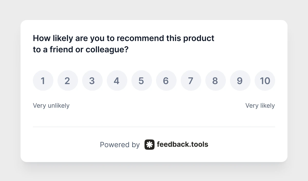
The practical reading for a B2B SaaS company that surveys its own users. The only comparable public figures are 8base's (2024): a typical range of 40-45 and a great B2B band of 39 to 65. No source given.
- A
30from an in-app survey is below both. - A
50is above the typical range and inside the great band. - A
70matches the software entries on HubSpot's list.
None of these tells you your market position. The comparison that tells you something is your own number from the previous quarter.
What moves the score besides product quality
Benchmarks assume everyone measures the same way. They do not. These five variables shift a score without anything changing in the product.
Survey channel
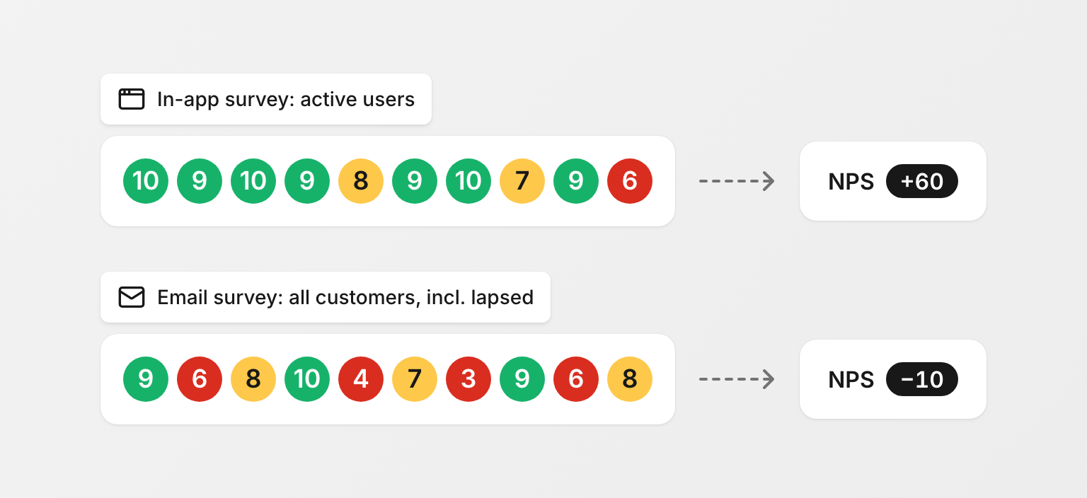
An in-app survey reaches people who are logged in and using the product. An email survey of the whole customer base also reaches the people who stopped logging in, and they answer differently. Active users are promoters at a higher rate than lapsed ones, so the in-app number comes out higher.
Neither is wrong. They measure different populations and should not be compared with each other.
The same ten buttons, shown in-app to someone mid-task and emailed to someone who churned last month, are two different surveys. Label them that way in your reporting.
Timing
A survey sent after a successful onboarding, a resolved support ticket or a renewal catches a customer at a high point. One sent on a fixed schedule does not.
The two kinds have names:
relationship NPS: the overall question, asked periodically, regardless of what the customer just did.transactional NPS: asked after a specific interaction or journey.
Shopify (2026)2 advises sending transactional surveys within 48 hours of the experience, which is also when the score runs highest. A benchmark that does not say which kind it reports is hard to use.
Region and culture
Geography is one of the variables a target score has to account for, next to industry and company size. The mechanism is the scale. A satisfied customer who rarely gives top marks answers 8, which on the NPS scale is a passive and contributes nothing.
If such customers are more common in some markets than in others, the same satisfaction produces a different NPS by country. A customer base with a growing share of those markets can see NPS drift down with no change in sentiment.
This is what good looks like from a satisfied customer who saves 9 and 10 for something exceptional. It adds zero to your score.
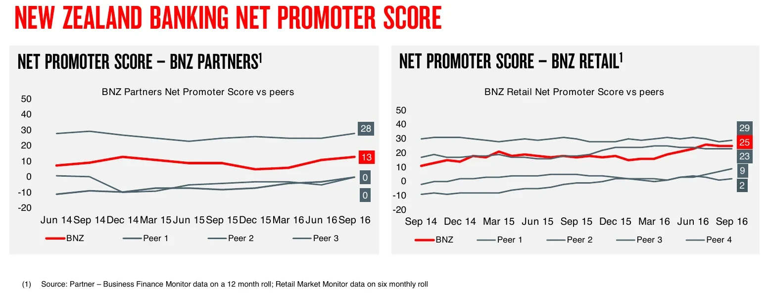
Neighbouring markets can sit far apart, even in one bank group's own reporting. In the same year as the Australian figures above, NAB8 reported that New Zealand banks scored between 2 and 29 with retail customers. The investor deck does not explain the gap, and neither does any public source. The safe reading: a benchmark from another country is not a benchmark for you.
B2B versus B2C
The two are not comparable, and a benchmark that does not say which one it reports is of limited use. 8base (2024)3 gives B2C SaaS an average of 54 and B2B SaaS a great band of 39 to 65, without a source. An average and a band are different kinds of figure, so they do not show which is higher.
The mechanism cuts both ways. A consumer answers for themselves. A B2B respondent answers for a team, a budget and a decision they may have made personally, which tends to make buyers generous and end users strict.
Sample size
NPS is the difference between two percentages, and both move with every response.
- With 100 responses, one person is one percentage point.
- One person who switches from
promotertodetractormoves the score by2points. - Three such people produce a drop of
6points with no change in the customer base.
The margin of error shrinks with the square root of the sample, so halving it takes four times the responses. Shopify (2026) suggests at least 100 to 200 responses per survey as the floor for seeing a trend.
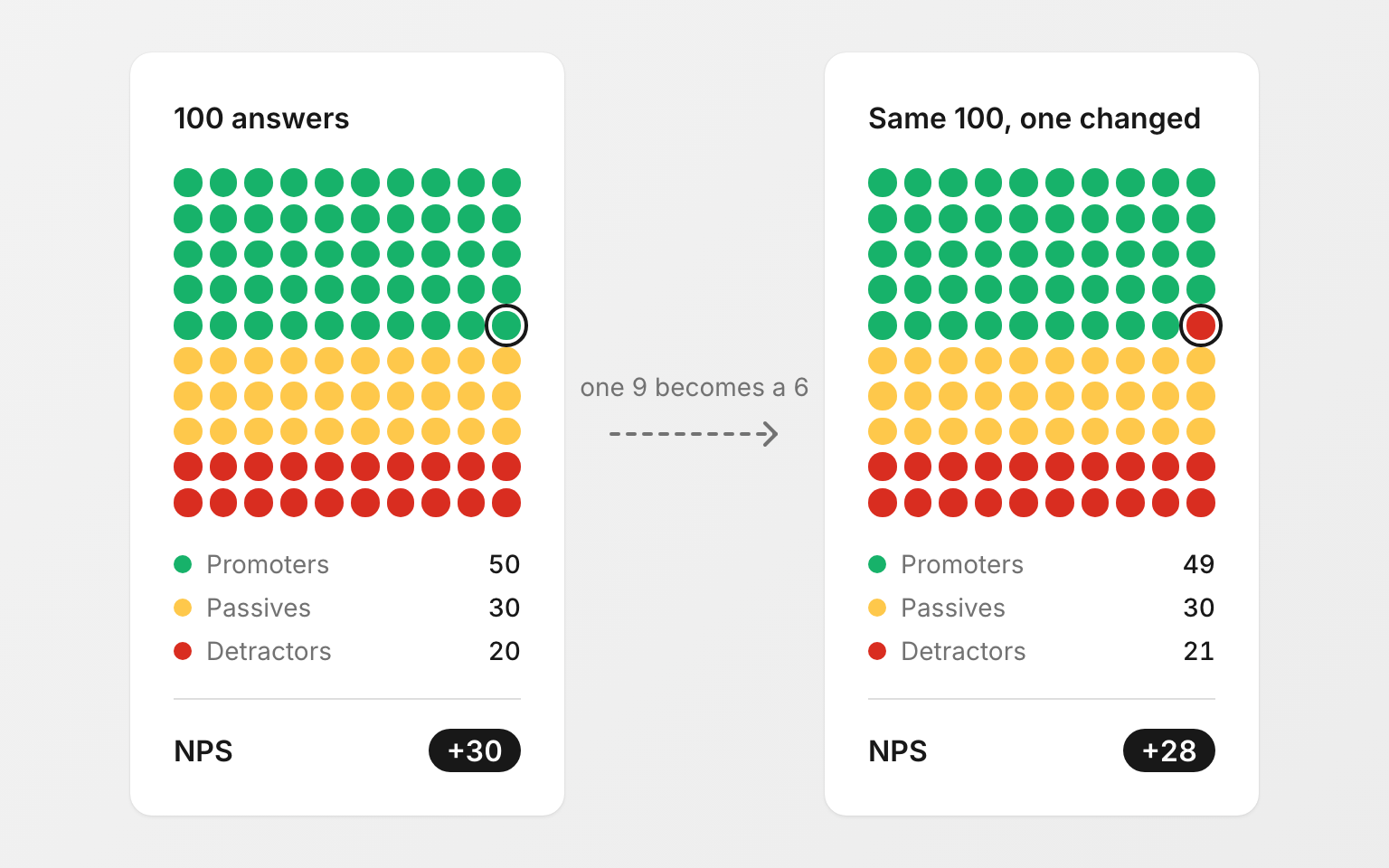
For a product with a few hundred users, a quarter-over-quarter change of 5 points can easily be noise. Watch the trend across several periods, and the raw counts of promoters and detractors, before reacting.
How to improve an NPS score
The score itself does not tell you what to change. The four actions below do, and they work at any starting point.
- Ask why, every time. A score with no follow-up question is a number you cannot act on. Add one open question after the rating and read the answers grouped by theme rather than one by one. A dozen detractors who all mention the same export bug are one fix, not twelve complaints.
Running the NPS question in-app with an open follow-up is what an NPS survey widget is for; the theme grouping is the part worth automating once volume grows. More follow-up variants, including a multiple-choice version, are on the recommend-to-a-friend question page.
- Close the loop with detractors. Reply to every
0-6within days, not at the end of the quarter. A detractor who hears back is a conversation, not a data point, and the reply is where you learn precisely what broke. - Convert passives, not just detractors. A
7or8is a customer who is satisfied and uninspired. Moving onepassiveto a9adds the same point to NPS as moving onedetractorto a7, and it is usually cheaper, because nothing is broken. Ask passives what would make the product a10. The answers tend to be specific. - Fix the top theme, then re-measure the same way. Change the channel or the timing between surveys and you will not know whether the score moved because of the fix or because of the method. Hold the method constant and compare against your own previous number.
A score that rises quarter over quarter, collected the same way, is a better signal than any external benchmark.
NPS scores of well-known companies
Searches for Tesla, Costco and Chick-fil-A come up next to "good NPS score", so here is what the non-vendor pages in the top results publish. Read it as a list of self-published figures: most carry neither a method nor a date, and no independent survey confirms any of them.
- HubSpot's list (2025):1 Princeton Mortgage
98, Tesla97, Nutanix92, Metro Bank82, Warby Parker80, Amazon73, Zoom70, Apple61. - 8base (2024)3 adds Zoom
72and Netflix67. - Eliassen5, a staffing firm, publishes its own
82.2over 15,000 surveys. - Life Is Good reports
91(Shopify, 2026)2.
Every figure here was collected by the company from its own customers, and published because it was good. A large gap between a company's own figure and an independent survey of its market is normal, and it is mostly the sample. Both can be accurate measurements of different things, and only the company's own figure resembles what your survey measures.
Costco and Chick-fil-A: the figures that circulate come from benchmark databases that state neither method nor date, so this post does not repeat them.
FAQ
Is a negative NPS score bad?
Yes. A negative NPS means more customers would discourage a recommendation than make one. It is also not a verdict on the business: the first measurement, or a survey that reaches lapsed customers, lands below 0 more often than the published figures suggest. Treat it as a reason to read the follow-up answers.
What is the average NPS score?
There is no single average, because the answer depends on who was asked. Fred Reichheld's original 2003 study10 found a median of 16 across 400 companies. Self-reported SaaS scores cluster around 40-45 (8base, 2024)3. The companies that publish their own scores report much higher ones: 61 to 98 on HubSpot's list of eight (2025)1. Pick the type that matches how you measure.
Is a good employee NPS (eNPS) the same as a good customer NPS?
The arithmetic is identical, but the benchmarks do not transfer. The figures above are for customers. Employees rate their employer on a different basis than customers rate a product, so compare eNPS against your own previous eNPS, not against the figures here.
Should I track NPS or CSAT?
Both, because they answer different questions. NPS measures loyalty, CSAT measures satisfaction with a specific interaction. The comparison is in NPS vs CSAT.
Sources
-
HubSpot, "What Is a Good Net Promoter Score?", 2025. ↩ ↩2 ↩3 ↩4 ↩5 ↩6 ↩7 ↩8 ↩9 ↩10
-
Shopify, "What Is a Good NPS Score? Benchmarks and Tips", 2026. ↩ ↩2 ↩3 ↩4 ↩5 ↩6 ↩7 ↩8 ↩9
-
8base, "What Is a Good NPS Score for SaaS?", 2024. ↩ ↩2 ↩3 ↩4 ↩5 ↩6 ↩7 ↩8
-
Salesforce, "What Is Net Promoter Score (NPS)? A Complete Guide", 2024. ↩ ↩2
-
Eliassen Group, "Net Promoter Scores: What Do the Numbers Really Mean?", 2022. ↩ ↩2 ↩3
-
IBM, "What is Net Promoter Score (NPS)?", 2024. ↩ ↩2
-
Bain & Company, "Net Promoter Score (NPS) & System". ↩
-
National Australia Bank, 2016 Half Year Investor Presentation, slide 53, and 2016 Full Year Investor Presentation, slide 77. NPS from Roy Morgan Research and DBM surveys. ↩ ↩2
-
Commonwealth Bank of Australia, 2026 Half Year Results Presentation, slide 13. Institutional NPS from the RFI Global Atlas survey, 12-month rolling average. ↩
-
Fred Reichheld, "The One Number You Need to Grow", Harvard Business Review, December 2003. ↩ ↩2 ↩3
-
Nutanix, Corporate Overview, investor presentation, May 2026, slide 7. ↩